Research, strategy, UX, UI and prototyping
Product design case study2023–2024
A clearer road to car finance in Africa.
I redesigned Autochek’s consumer experience to help people find a car, understand financing and move from interest to application with less friction.

01 The context
The brief
Revolutionising car finance systems across six African markets.
Autochek Africa is an automotive technology company with more than 500 service centres. Its ambition is to make car commerce and financing work better across West, East and North Africa.
The product had to serve customers looking for a vehicle, dealers listing inventory and internal teams processing loans. Disconnected systems, a dense homepage and a long application journey were creating avoidable friction for each group.
How might we help people understand their options, find the right car and begin financing without relying on a customer-care call?
Consumer, dealer and internal systems
Product, engineering, operations and finance
Maze, Jira, Forms, Sheets and Zeplin
02 The challenge
Problem statement
One ecosystem.
Three very different kinds of friction.
Customers lacked a clear path
Navigation was difficult, financing felt opaque and the application flow was long enough to push users toward customer care.
Teams worked across fragmented tools
Dealers and internal staff needed one place to upload cars, speak with customers, track journeys and manage loan offers.
Early answers took too long
A loan-processing engine had to provide tentative offers sooner, reduce call-centre volume and create a stronger path to conversion.
03 The process
12 months from ambiguity to tested interface
Research first. Decisions second. Pixels last.
- 01Research
Interviews, surveys, SWOT and competitor review
- 02Define
Personas, journey map, goals and empathy mapping
- 03Ideate
Card sorting, flows and information architecture
- 04Design
Wireframes, visual system and interactive prototypes
- 05Test
Usability sessions, behavioural evidence and iteration
04 Discovery
0people
I spoke with people who had already tried to finance a car.
Qualitative interviews and a Google Forms survey explored navigation, onboarding, loan applications, mobile performance, trust and transparency.
Interview prompts
- Can you easily find the information you are looking for?
- From the homepage, what three things do you think Autochek offers?
- Which elements on the homepage are confusing?
- How easy is registration and getting started with financing?
- How easy is the loan application process?
- Did you receive help while applying or need to call customer care?
- What is the mobile experience like?
- What are your biggest fears about financing a car online?
- How transparent are the rates, fees and terms?
Too much information, too little direction
People struggled to understand the landing page and locate the next useful step.
Mobile was the main experience
Most traffic came through phones, while cut-off content and dense layouts made the experience harder.
The loan process felt risky
Complex steps, unclear charges and limited guidance drove abandonment and support calls.
People needed better decision tools
Clear photos, car history, useful filters and a trustworthy calculator mattered before application.
05 What the data said
Survey signals
The mobile journey was business-critical—and clearly underperforming.
25%
Found the loan application easy
Three in four participants said no.
76%
Accessed the site on mobile
Mobile had to become the default design lens.
42%
Received clear financing guidance
More than half were still unsure how to start.
Mobile experience4/10
Car knowledge4/10
Homepage navigation6/10
Registration7/10
Filter behaviour
Price and year did the heaviest decision-making work.
Filters were reduced and reordered around observed behaviour instead of internal assumptions.
06 Designing for real contexts
Two decision modes
Confidence for the informed buyer. Guidance for the first-time buyer.

Persona 01
Mark, 32
Creative Director · Nairobi“I want to research and compare options on my own.”
Goals
- Move quickly
- Compare rates
- Understand the full cost
Friction
- Clunky interfaces
- Hidden fees
- Unclear application steps

Persona 02
Sarah, 28
Marketer · Nakuru“This is my first car. I need someone to walk me through it.”
Goals
- Find affordable options
- Get plain-language guidance
- Feel secure
Friction
- Technical jargon
- Pressure to decide
- Limited support
07 From findings to structure
Information architecture
One connected path from discovery to ownership.
The structure brought search, car details, financing, applications and account activity into a system people could predict.
01Entice
Search and compare cars
02Enter
Review condition and estimate finance
03Engage
Apply, receive and accept an offer
04Exit
Pay equity and collect the car
05Extend
Repay monthly and rate the experience
08 Design phase
Low fidelity first
Making the route obvious before making it beautiful.
Early sketches and wireframes tested country selection, home discovery, car listings, details, filters, profile and financing flows.
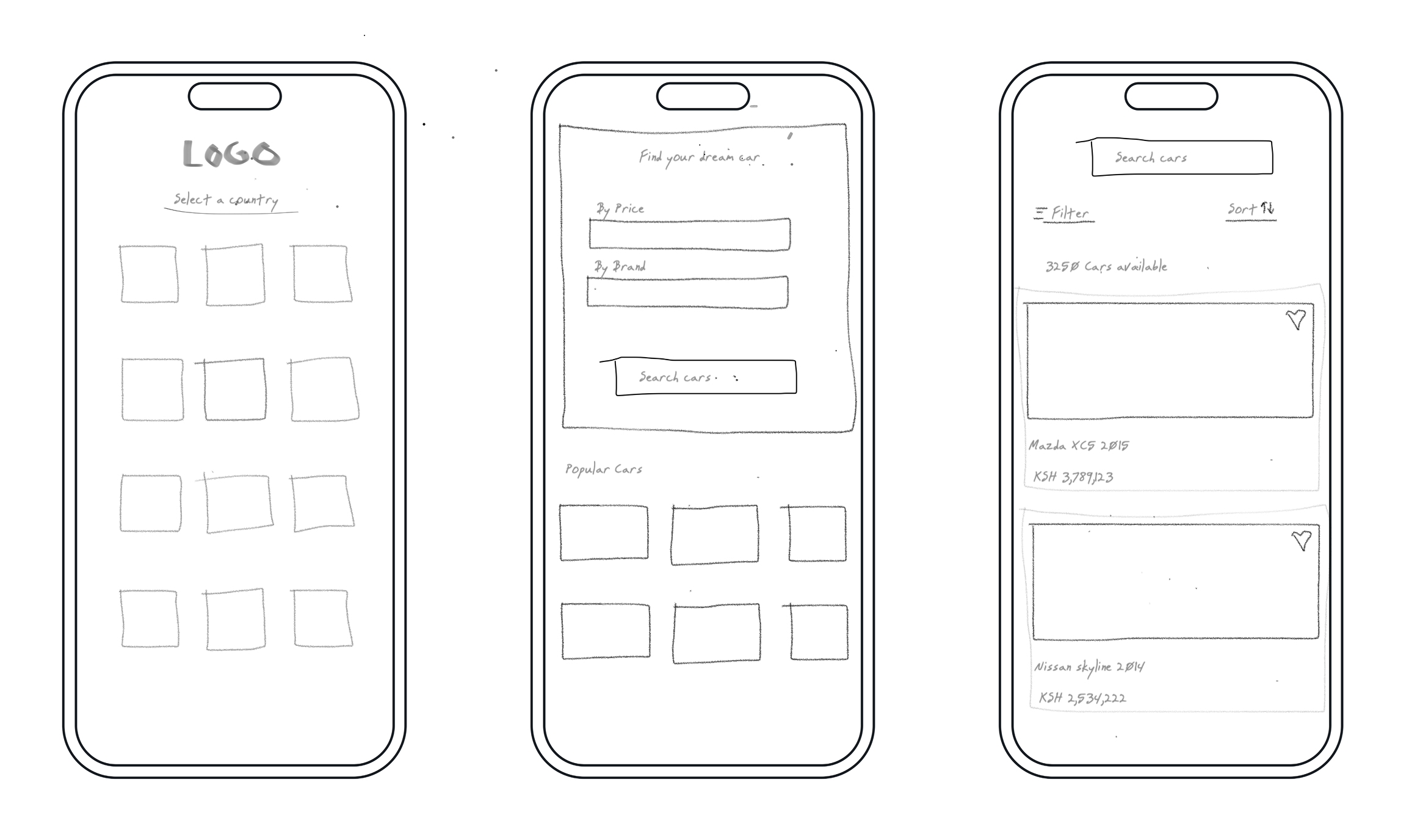
01 · Find the right entry02 · Reduce filter choices03 · Make finance visible
09 Visual system
Built for clarity
A compact design language that could scale across products.
Inter supports clear reading at small sizes, while the warm gold signals action and the deep navy carries trust and financial weight.
Aa
Inter56 / 48 / 40 / 32 / 24 / 20
Think Cars,
Think Autochek.
#FFB619Action
#30345ETrust
#CAC7C7Structure
#1B1818Type
#F6DA9DWarmth
10 The homepage solution
Try the interaction
Fewer choices up front.
Better choices underneath.
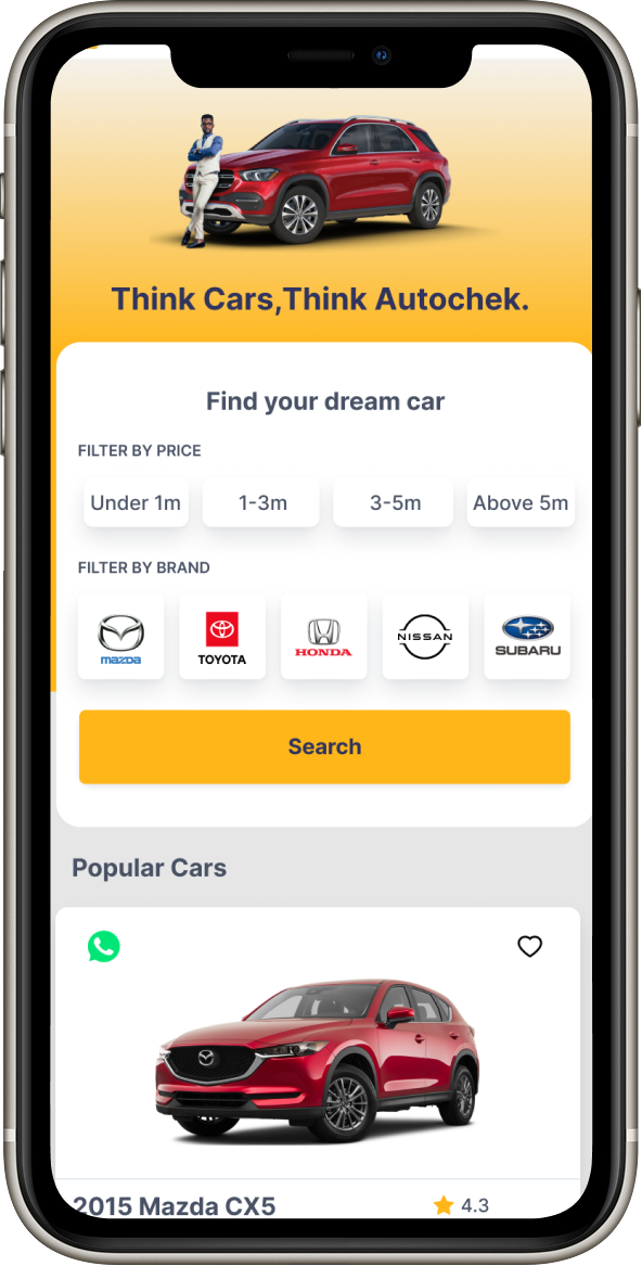
The homepage became a guided starting point: choose a market, set a useful budget and see relevant inventory without fighting the interface.
Decision 01 / 03
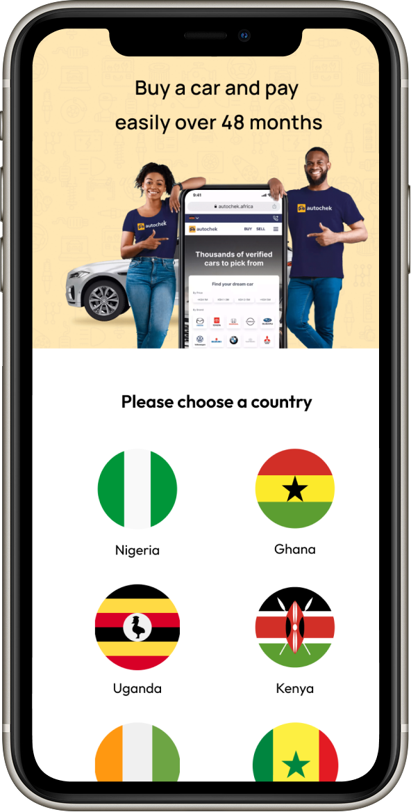
Choose a country before showing complexity.
Local context changes inventory, currency and finance. Making that decision first removes ambiguity from everything that follows.
9:41● ● ●
autochekBUY SELL ☰
Please choose a country
What is your budget?
Popular near KenyaKSh 1–3m
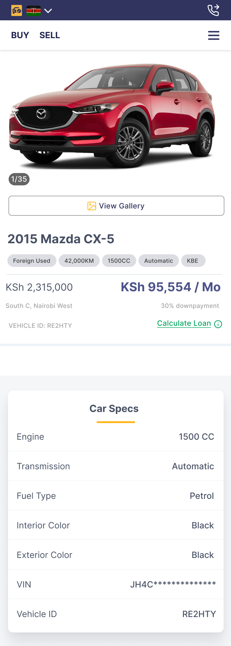
2015 Mazda CX-542,000 km · AutomaticKSh 2,315,000
A focused menu declutters the homepage.
Secondary destinations stay available without competing with the primary job: finding and financing a car.
Popular inventory reduces a cold start.
Sales and inquiry data can surface relevant cars for people who do not arrive with a model in mind.
Finance is primary; cash remains visible.
The filled loan action reflects the business model, while the ghost-style cash option retains user control.
11 Final interface
From browse to ownership
One visual language across the entire journey.
The interface turns the research into four clear product decisions. Each card pairs the reason behind the design with the screen that delivers it.
See how it tested ↓
01
Find the right starting point
Choose a market first, then search by the decisions users understand fastest.
- Country-first context
- Budget-led discovery
- Data-led popular cars
02
Make filtering feel lighter
Progressive filters keep the first screen calm while deeper controls remain close.
- Price and year prioritised
- Advanced filters on demand
- Results remain visible
03
Build confidence before the call
Vehicle details and condition information answer the questions that used to require support.
- Scannable specifications
- Visible condition report
- Clear payment choices
04
Keep the finance journey visible
Applications, offers and progress live together so people always know what happens next.
- Track application status
- Review active offers
- Return without losing context
A closer look
Main page breakdown
These are the primary moments of the experience: helping people start a search, then helping them decide what to do next.
Homepage
Make the first decision feel simple.
Focused navigation
A compact menu protects the primary task—finding a car—while the full product remains easy to reach.
Guided filters
Price and brand lead the search because they were the filters people asked for most in research.
Flexible banner
A changeable banner creates space for campaigns, promotion and user education without disrupting the journey.
Popular cars
Sales and enquiry signals surface relevant vehicles for people who arrive without a model in mind.
Car listing page
Keep the next useful action in view.
Progressive filters
Simple controls appear first; deeper filters stay available without overwhelming people before they see results.
Scannable vehicle cards
Image, price, mileage and key specifications are grouped so people can compare options at a glance.
Payment hierarchy
Applying for finance is visually primary, while cash remains a clear secondary option for user control.
Results that build confidence
Consistent images and transparent car details reduce uncertainty before someone begins an application.
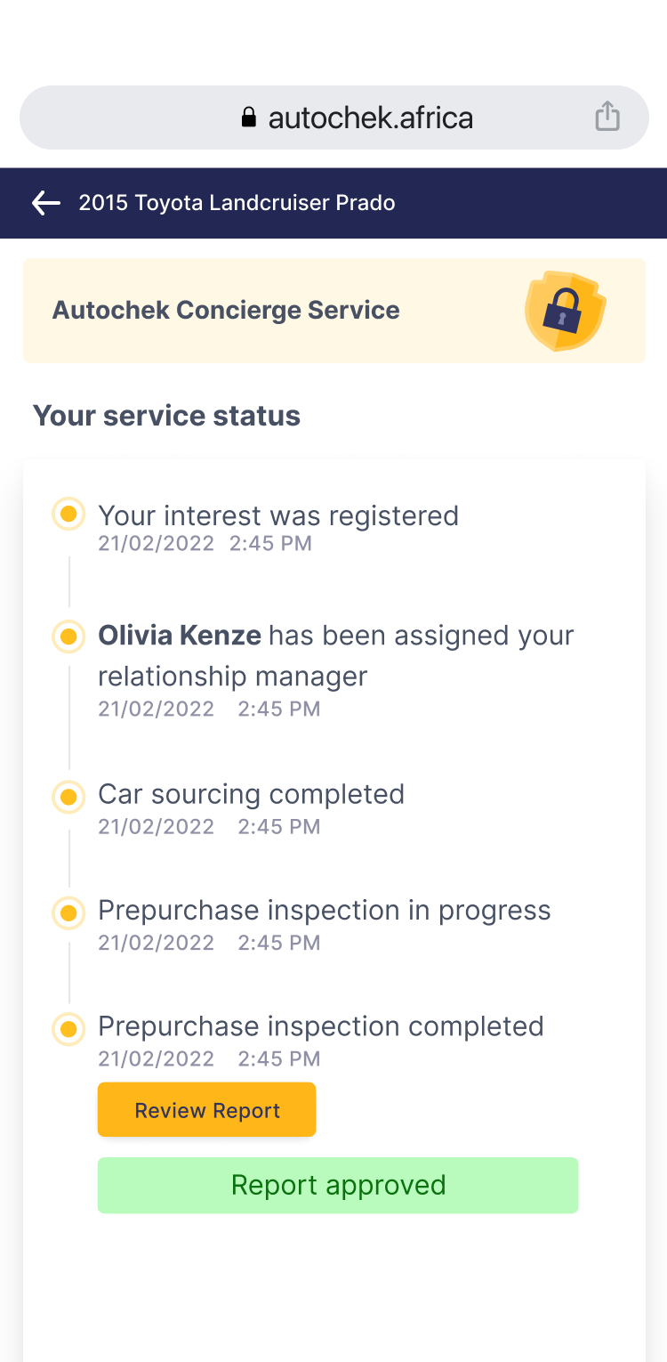
12 Financing journey
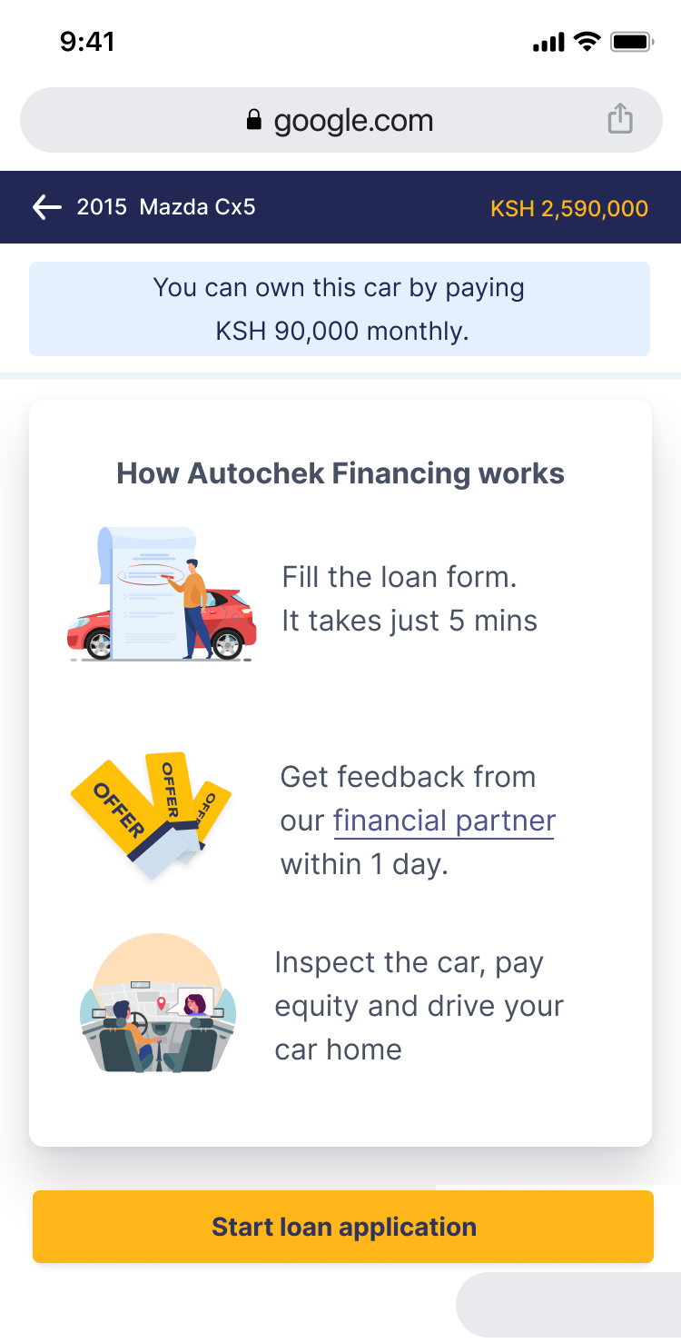
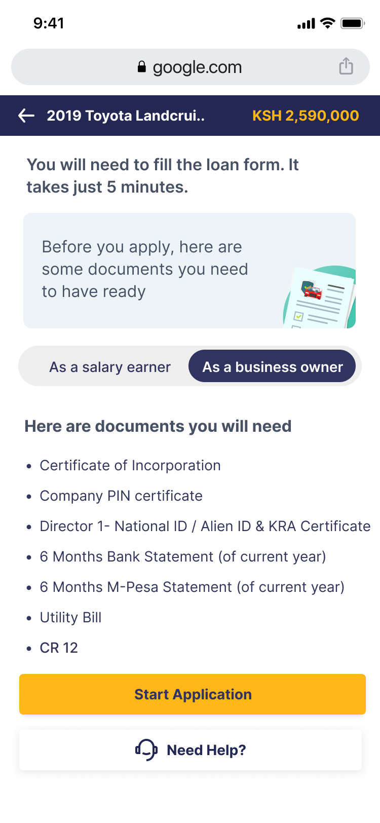
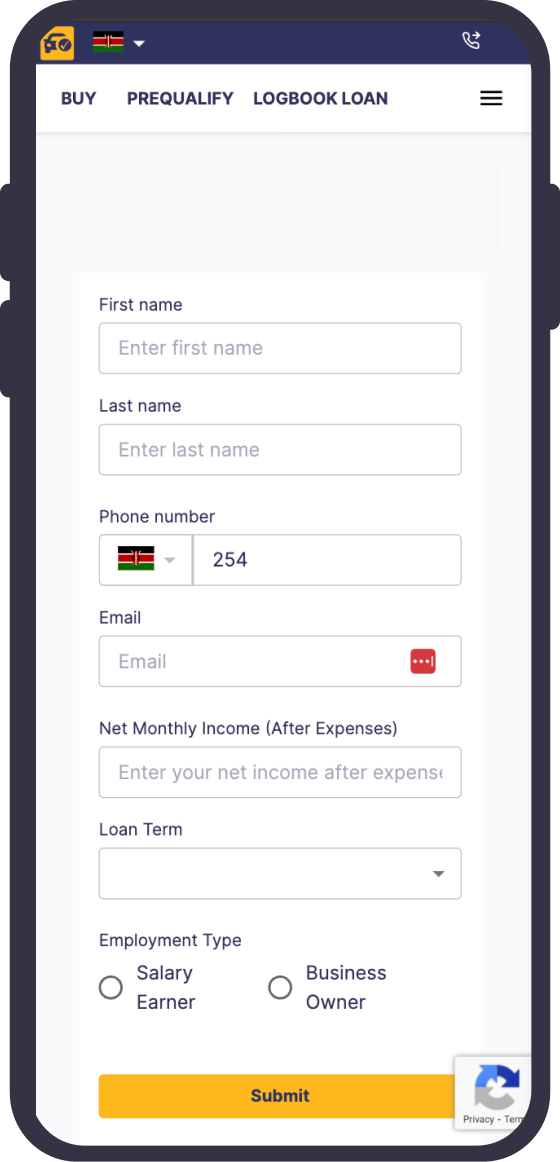
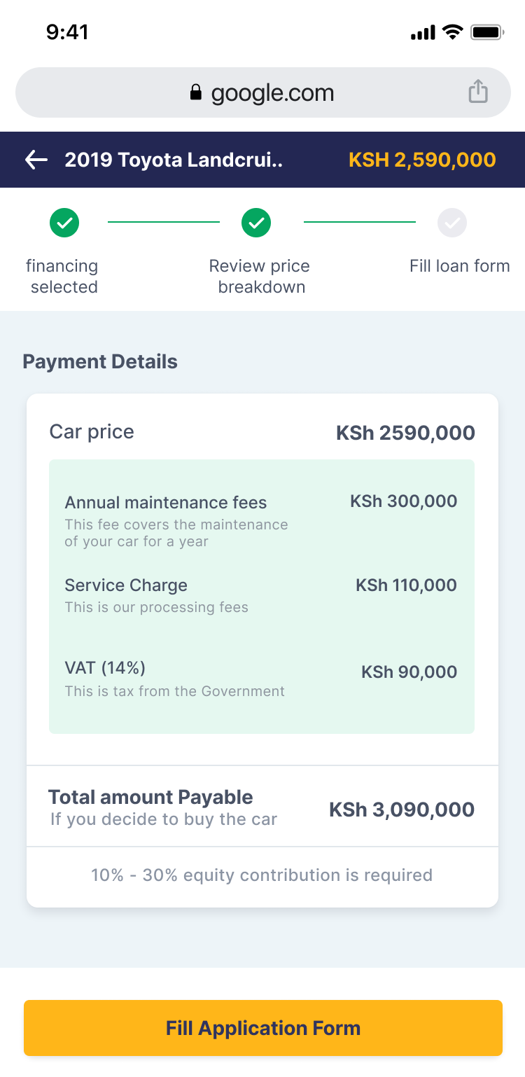
Clarity at the point of commitment
Show the process, the price and the next step.
13 Test, learn, improve
0participants
Testing exposed two missing confidence builders.
Moderated Google Meet sessions and behavioural evidence from Microsoft Clarity were used to observe car discovery, filtering, calculator use, application and offer acceptance.
“Can I afford this before I apply?”
Users wanted a quick eligibility signal that could reduce uncertainty and avoid preventable rejection.
“What will this loan actually cost?”
The calculator needed to show a more complete monthly estimate, including fees and additional charges.
14 Implementing feedback
New feature
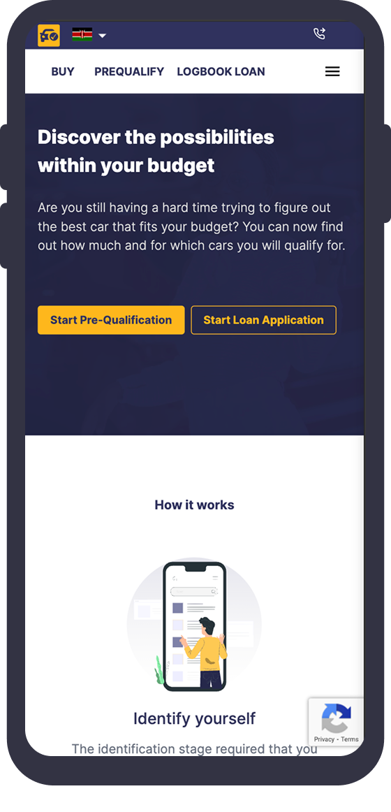
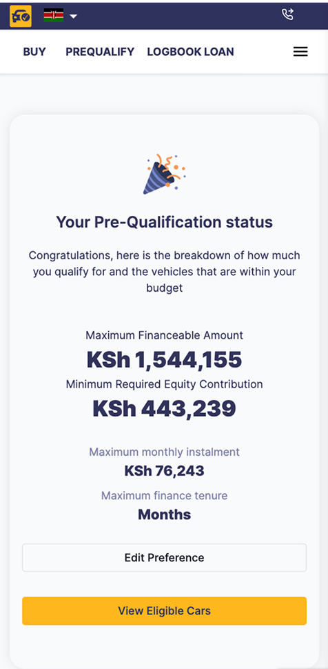
Pre-qualification before application.
People can enter income, expenses, phone number and preferred loan term to receive an instant affordability estimate before committing to a full application.
- Reduces avoidable applications
- Sets a realistic buying range
- Creates a qualified lead for follow-up
Improved feature
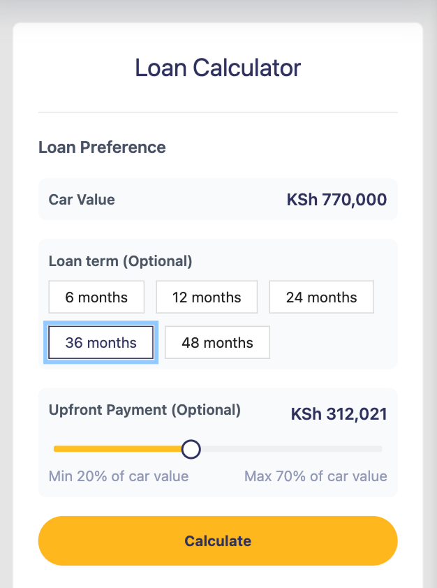
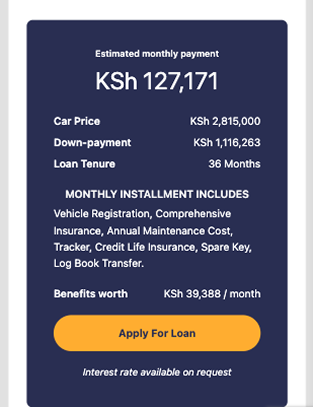
A calculator people could trust.
The new calculator exposes car price, down payment, loan term, monthly instalment and included costs before the application begins.
- More accurate estimates
- Charges surfaced earlier
- Clearer connection to application
The outcome
A more understandable journey—and a stronger foundation for conversion.
Less friction
A mobile-first structure reduced the cognitive load of discovery and application.
More confidence
Condition reports, affordability and cost breakdowns made difficult decisions easier to understand.
Better business signals
Pre-qualification increased leads and helped reduce avoidable loan rejections.
A scalable system
The design language extended across consumer, dealer and internal workflows.
Outcome statements reflect findings documented during the project; exact confidential business metrics are not disclosed.